Do colors affect your mood?
The experts say they do.
Color is everywhere, but does it mean anything?
Different colors often have different meanings in various
cultures. And even in Western societies, the meanings of various colors have
changed over the years. But today in the U.S., researchers have generally found
the following to be accurate.
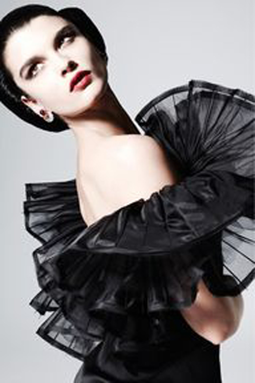
The color of authority and power. It is popular in fashion
because it makes people appear thinner. It is also stylish and timeless. Black
also implies submission. Priests wear black to signify submission to God. Some
fashion experts say a woman wearing black implies submission to men. Black
outfits can also be overpowering, or make the wearer seem aloof or evil.
Villains, such as Dracula, often wear black.

White
Brides wear white to symbolize innocence and purity. White
reflects light and is considered a summer color. White is popular in decorating
and in fashion because it is light, neutral, and goes with everything. However,
white shows dirt and is therefore more difficult to keep clean than other
colors. Doctors and nurses wear white (NOT SO MUCH ANYMORE) to imply sterility.

Red
The most emotionally intense color, red stimulates a faster
heartbeat and breathing. It is also the color of love. Red clothing gets
noticed and makes the wearer appear heavier. Since it is an extreme color, red
clothing might not help people in negotiations or confrontations. Red cars are
popular targets for thieves. In decorating, red is usually used as an accent.
Decorators say that red furniture should be perfect since it will attract
attention.

Pink
The most romantic color, pink, is more tranquilizing. Sports
teams sometimes paint the locker rooms used by opposing teams bright pink so
their opponents will lose energy.

Blue
The color of the sky and the ocean, blue is one of the most
popular colors. It causes the opposite reaction as red. Peaceful, tranquil blue
causes the body to produce calming chemicals, so it is often used in bedrooms.
Blue can also be cold and depressing. Fashion consultants recommend wearing
blue to job interviews because it symbolizes loyalty. People are more
productive in blue rooms. Studies show weightlifters are able to handle heavier
weights in blue gyms.

Green
Currently the most popular decorating color, green
symbolizes nature. It is the easiest color on the eye and can improve vision.
It is a calming, refreshing color. People waiting to appear on TV sit in
"green rooms" to relax. Hospitals often use green because it relaxes
patients. Brides in the Middle Ages wore green to symbolize fertility. Dark
green is masculine, conservative, and implies wealth. However, seamstresses
often refuse to use green thread on the eve of a fashion show for fear it will
bring bad luck.

Yellow
Cheerful sunny yellow is an attention getter. While it is
considered an optimistic color, people lose their tempers more often in yellow
rooms, and babies will cry more. It is the most difficult color for the eye to
take in, so it can be overpowering if overused. Yellow enhances concentration,
hence its use for legal pads. It also speeds metabolism.

Purple
The color of royalty, purple connotes luxury, wealth, and
sophistication. It is also feminine and romantic. However, because it is rare
in nature, purple can appear artificial.

Brown
Solid, reliable brown is the color of earth and is abundant
in nature. Light brown implies genuineness while dark brown is similar to wood
or leather. Brown can also be sad and wistful. Men are more apt to say brown is
one of their favorite colors.
Food for Thought
While blue is one of the most popular colors it is one of
the least appetizing. Blue food is rare in nature. Food researchers say that
when humans searched for food, they learned to avoid toxic or spoiled objects,
which were often blue, black, or purple. When food dyed blue is served to study
subjects, they lose appetite.
Green, brown, and red are the most popular food colors. Red
is often used in restaurant decorating schemes because it is an appetite
stimulant.
Can you identify with any of this research? Does color affect your mood? For me, I think it does, even in subtle ways.
Hello Sanda
ReplyDeleteAn excellent post and brilliant study of the psychology of colour. I can say for definite that colour is very important to me and does indeed have a bearing on my mood.
Have a glorious weekend
Helenxx
Thank you, Helen. As a painter, I know you fully understand the effect color has on mood.
DeleteI agree with Helen above. A clear, basic, and simple enough ( for me ; ) post about colors.
ReplyDeleteWhite and green as basics for hospital interiors makes sense.
The surroundings, the climate we live in, does affect our choices.
Those living in a country filled with bright colors, find it easier to use them e.g.
on their fashion choices. On the contrary, people working with color, fabrics, seem to use minimal color in their private life.
One can get an over doze of colors too ;).
In general, in my opinion, the best color for yourself, is the one, which makes you feel relaxed.
I agree that overdoses of color are no good. Good policy: the best color is the one that makes you feel relaxed, regardless of what the "experts" have found.
DeleteA fascinating insight into the moods of colour, and yes I also am very sensitive to colour, both in surroundings and in what I wear. I find subtle browns and greys quite depressing if there is too much of them about, and love using pink and turquoise. HB and I often talk about the colour of men's ties, and the ability to convey a particular message by the colour. Red = power and control, light blue means I am friendly and on your side, etc.
ReplyDeleteSo true about the color in ties men choose to convey messages!
DeleteI think colour combinations affect my mood a lot. Individual colours, not always. There are so many moods to even one shade of colour.
ReplyDeleteHi Jenny, thanks for stopping by and leaving a comment. Hope you are having happy travels this summer.
DeleteI was surprized to read that blue increasies productivity. While it is my absolute favourite colour, blue environment makes me mellow and sleepy. I had a blue bedroom once and I couldn't even read in it because it made me feel sleepy instantly.
ReplyDeleteNow the walls of my bedroom are lavender and I'm very happy with the choice, it's soothing, relaxing and it doesn't make me sleepy :-)
As always a great post!
Doesn't get any more soothing than having lavender walls in the bedroom. More relaxing than blue, IMO.
DeleteInteresting post. I know some colors are more comfortable for me than others - both in my home and in my wardrobe. For instance there is no yellow anywhere. Maybe I should have some, my metabolism could sure use a boost! I am most fond of the entire blue family.
ReplyDeleteDarla
I was rather surprised to see that the findings were that yellow increases metabolism. All that bright cherriness making one feel energized I suppose. The blue family of colors is my favorite as well.
DeleteHere from Helen's blog. I was surprised to find black linked with submission as I have always associated the color with ascendancy and independence. Have you read the book, 'Drunk Tank Pink?' I think you would find it very interesting.
ReplyDeleteHi Suze, thanks for visiting and leaving a comment. I am not familiar with the book you mention, but I will investigate; always looking for a book recommendation, so thanks!
Delete